Empowering patients with cost transparency.
Nurx is a consumer telehealth platform that provides convenient access to asynchronous care and medication delivery. We were tasked with creating an A/B test with limited time and tight constraints to improve checkout conversion on a major drop off point - checkout.
Results
Coming soon!
Key metric
Improve checkout page CVR by 2%
The team
• Associate director, product
• Engineering manager
• Strategy and Operations stakeholders
Narrowing the focus
All twelve service lines shared the same cart page, but they did not perform the same. Mental health saw nearly double the checkout drop-off rate (58%) compared to lower-acuity service lines (~20%). This directly correlated with its unique product structure—it requires a $59 monthly subscription fee in addition to the cost of medication. For this reason, we chose to focus our test efforts on the mental health service line, with service scalability as a primary design goal.

Getting unbiased feedback (quickly!)
The team—including myself—experienced a bit of confirmation bias, which made it challenging to let go of our preconceived notions about what “checkout” needed to be.
To quickly re-evaluate how we present treatment information in a way that aligns with patient expectations, I recruited a panel of five friends and family for a moderated usability test focused on content design. Their feedback provided additional context to guide directional learnings from our previous tests.
Moderated usability sessions validated our assumptions:
Problem one
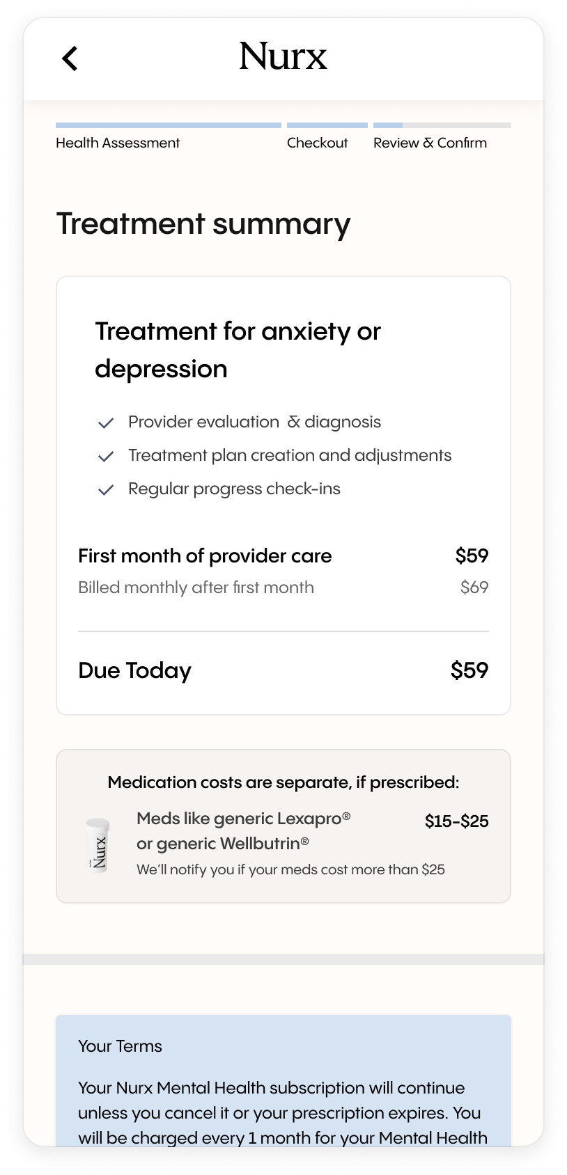
Hiding subscription cost details was undermining trust
Much of the important pricing information - including the monthly subscription fee - was buried in tooltips, which users didn’t realize they would be paying. This lack of transparency eroded both trust in the brand and checkout intent.
Problem two
The checkout page was misrepresenting our service offering
Users didn’t understand what they were actually paying for. In reality, patients pay for provider time, and medication is billed separately after checkout. When asked what they expected to receive with their “purchase,” all participants assumed they were paying for medication.
Isolating changes to solve both problems
Test 1
Surface the monthly subscription fee
Because the subscription fee was previously hidden, we isolated pricing from design to avoid conflating results. We reframed the initial consultation as the first month of care, aligning with competitors. Keeping the experiment lightweight allowed us to get a clear signal in 3 days, while continuing parallel design exploration.
Results
We saw a 2% increase in checkout CVR, a clear signal that setting clear price expectations can have a positive impact on the business.
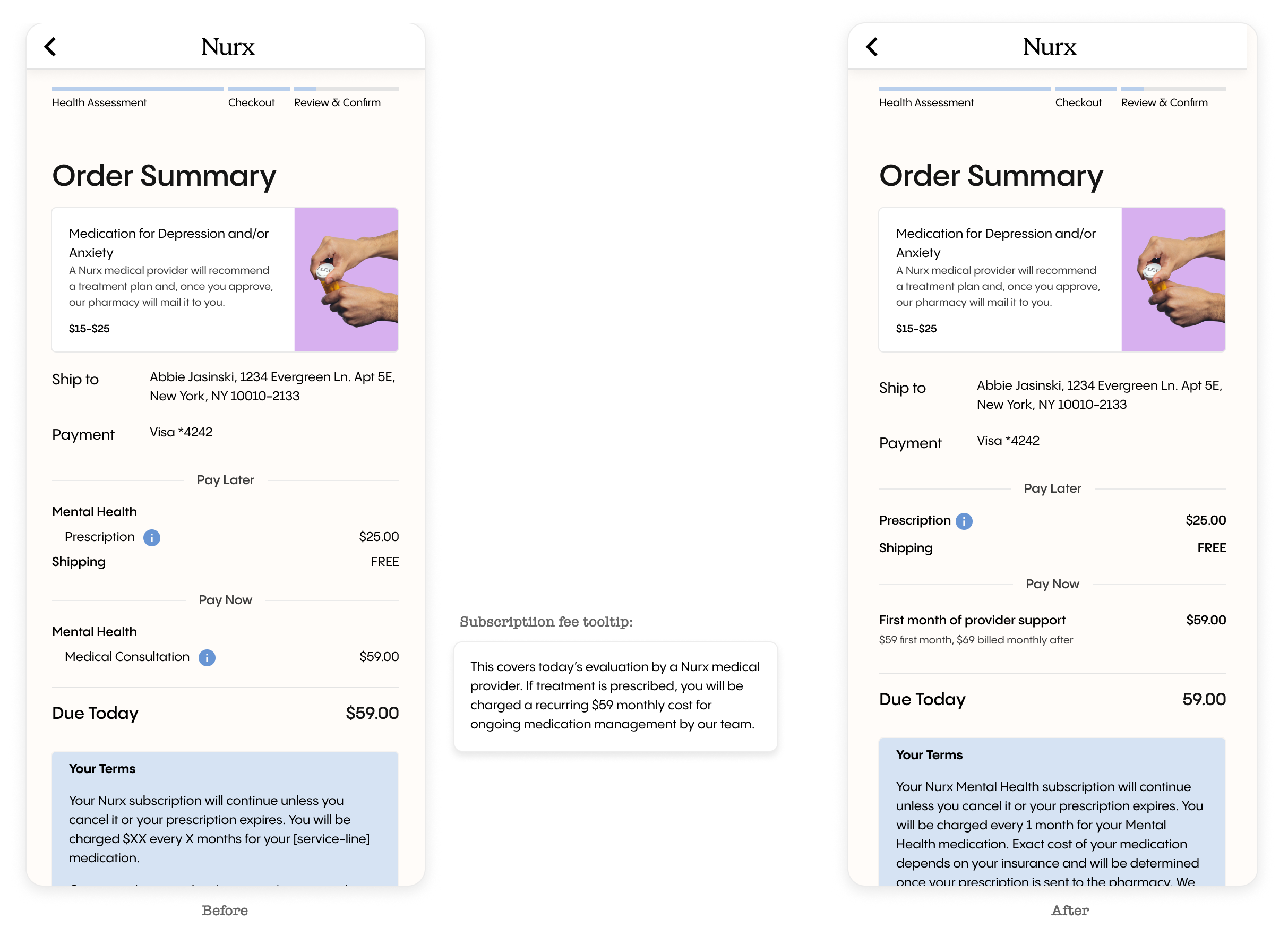
Test 2
Improve cost and service transparency
To date, small design changes had not been making any meaningful improvements to checkout conversion. We wanted to take a big swing and completely restructure the design of this page to match our service offering: you pay for provider time now, and medication is billed separately.
What changed
Content clarity 📋
Simplified the hierarchy to clearly present what a patient is payinf for at checkout - provider care with the option to prescribe -removing confusing medication language.
Clinical value 🩺
Added clear value props to justify cost and help patients evaluate the care provided.
Subscription pricing 💰
Preserved the test language while increasing visual emphasis and isolating it as the sole line item.
Medication costs 💊
Clarified that providers may prescribe when appropriate and that medication costs are separate.